Scatter Plots

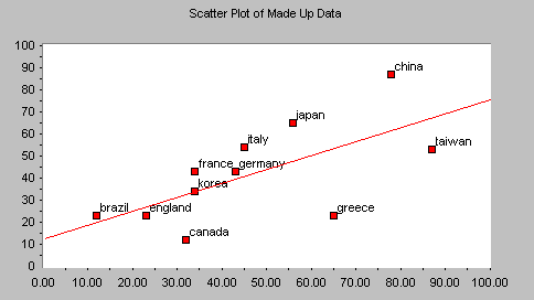
Scatter Plots (also called scatter diagrams) are used to investigate the possible relationship between two variables that both relate to the same "event." A straight line of best fit (using the least squares method) is often included.
Things to look for:
- If the points cluster in a band running from lower left to upper right, there is a positive correlation (if x increases, y increases).
- If the points cluster in a band from upper left to lower right, there is a negative correlation (if x increases, y decreases).
- Imagine drawing a straight line or curve through the data so that it "fits" as well as possible. The more the points cluster closely around the imaginary line of best fit, the stronger the relationship that exists between the two variables.
- If it is hard to see where you would draw a line, and if the points show no significant clustering, there is probably no correlation.
Caution!
There is a maxim in statistics that says, "Correlation does not imply causality." In other words, your scatter plot may show that a relationship exists, but it does not and cannot prove that one variable is causing the other. There could be a third factor involved which is causing both, some other systemic cause, or the apparent relationship could just be a fluke. Nevertheless, the scatter plot can give you a clue that two things might be related, and if so, how they move together.
Scatter Plot statistics:
For scatter plots, the following statistics are calculated:
| Mean X and Y: | the average of all the data points in the series. |
| Maximum X and Y: | the maximum value in the series. |
| Minimum X and Y | the minimum value in the series. |
| Sample Size | the number of values in the series. |
| X Range and Y Range | the maximum value minus the minimum value. |
| Standard Deviations for X and Y values | Indicates how widely data is spread around the mean. |
| Line of Best Fit - Slope | The slope of the line which fits the data most closely (generally using the least squares method). |
| Line of Best Fit - Y Intercept | The point at which the line of best fit crosses the Y axis. |

