Bar Charts

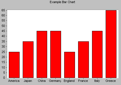
Bar Charts, like pie charts, are useful for comparing classes or groups of data. In bar charts, a class or group can have a single category of data, or they can be broken down further into multiple categories for greater depth of analysis.
Things to look for:
Bar charts are familiar to most people, and interpreting them depends largely on what information you are looking for. You might look for:
- the tallest bar.
- the shortest bar.
- growth or shrinking of the bars over time.
- one bar relative to another.
- change in bars representing the same category in different
- classes.
Other tips:
- Watch out for inconsistent scales. If you're comparing two or more charts, be sure they use the same scale. If they don't have the same scale, be aware of the differences and how they might trick your eye.
- Be sure that all your classes are equal. For example, don't mix weeks and months, years and half-years, or newly-invented categories with ones that have trails of data behind them.
- Be sure that the interval between classes is consistent. For example, if you want to compare current data that goes month by month to older data that is only available for every six months, either use current data for every six months or show the older data with blanks for the missing months.
Bar chart statistics:
For each bar in the bar chart, the following statistics are useful:
| Mean | the average height of all the bars. |
| Maximum | the maximum value (tallest bar) in the series. |
| Minimum | the minimum value (shortest bar) in the series. |
| Sample Size | the number of values (bars) in the series. |
| Range | the maximum value minus the minimum value. |
| Standard Deviation | Indicates how widely data is spread around the mean. |

