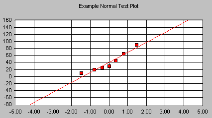
Normal Test Plot

Normal Test Plots (also called Normal Probability Plots or Normal Quartile Plots) are used to investigate whether process data exhibit the standard normal "bell curve" or Gaussian distribution.
First, the x-axis is transformed so that a cumulative normal density function will plot in a straight line. Then, using the mean and standard deviation (sigma) which are calculated from the data, the data is transformed to the standard normal values, i.e. where the mean is zero and the standard deviation is one. Then the data points are plotted along the fitted normal line.
The nice thing is that you don't have to understand all the transformations. All you have to do is look at the plotted points, and see how well they fit the normal line. If they fit well, you can safely assume that your process data is normally distributed. That gives you confidence in your process capability indices, and in % of non-conforming parts projections.
If your plotted points don't fit the line well, but curve away from it in places, you may have a non-normal distribution. That may mean that you need to get some expert help in understanding your process. At the very least, you should suspect your process capability indices (don't even calculate them), and realize that you may be making more out-of-spec parts than you thought.
Things to look for:
First, look for points that are widely separated from the others. Could these be the result of measurement or entry error? Or are they real points that should be part of the distribution? Then, compare your plot to the plots shown below. Does it exhibit one of these shapes?
| If your chart looks like this: |
It indicates that your distribution has: |
 |
Right Skew - If the plotted points appear to bend up and to the left of the normal line that indicates a long tail to the right. |
 |
Left Skew - If the plotted points bend down and to the right of the normal line that indicates a long tail to the left. |
 |
Short Tails - An S shaped-curve indicates shorter than normal tails, i.e. less variance than expected. |
 |
Long Tails - A curve which starts below the normal line, bends to follow it, and ends above it indicates long tails. That is, you are seeing more variance than you would expect in a normal distribution. |
If you have a skewed distribution, or long tails, you may well have points in the tail(s) which are beyond specification limits. You will need to decide what to do about this…do you change the process to eliminate the long tail, or do you use inspection, or do you live with infrequent out-of-spec parts? The answer will depend on your process and your product. One rule of thumb, though, is that it is usually cheaper to fix problems where they occur, than to inspect, rework, or have upset customers downstream.
Normal Test Plot statistics:
For the x data and the y data, the following statistics are calculated:
| Mean | The average of all the data points in the series. |
| Minimum | The smallest value in the series. |
| Maximum | The biggest value in the series. |
| Std Dev | An expression of how widely spread the values are around the mean. |
| Skewness | Is the cumulative density function symmetrical? If so, skewness is zero. If the left hand tail is longer, skewness will be negative. If the right hand tail is longer, skewness will be positive. |
| Kurtosis | Kurtosis is a measure of the pointiness of a distribution. The standard normal curve has a kurtosis of zero. The Matterhorn has negative kurtosis, while a flatter curve would have positive kurtosis. Positive kurtosis is usually more of a problem for quality control, since, with "big" tails, the process may well be wider than the spec limits. |
| Anderson-Darling statistic | This measures how well the points in your data set fit the goodness of fit. If this value is greater than .753, you can be 95% confident that your data comes from a non-normal distribution. If the value is close to .75, you can't be sure, and you should keep an eye on this statistic as you collect more data. |
Recommended Reading:

