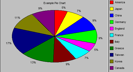
Pie Charts

Pie charts are used to show classes or groups of data in proportion to the whole data set. The entire pie represents all the data, while each slice represents a different class or group within the whole.
Things to look for:
- Look for the largest piece to find the most common class.
- Notice relative sizes of pieces. Some classes might be unexpectedly similar or different in size.
- Try looking at a two-dimensional view of the pie; 3D charts are attractive but they can make pieces at the front of the picture look bigger than they really are.
Pie chart statistics:
For the pie chart, the following statistics are calculated:
| Mean | the average of all the data points in the series. |
| Maximum | the maximum value (biggest slice) in the series. |
| Minimum | the minimum value (smallest slice) in the series. |
| Sample Size | the number of values (slices) in the series. |
| Range | the maximum value minus the minimum value. |
| Standard Deviation | Indicates how widely data is spread around the mean. |

