Pareto Charts

Vilfredo Pareto, a turn-of-the-century Italian economist, studied the distributions of wealth in different countries, concluding that a fairly consistent minority – about 20% – of people controlled the large majority – about 80% – of a society's wealth. This same distribution has been observed in other areas and has been termed the Pareto effect.
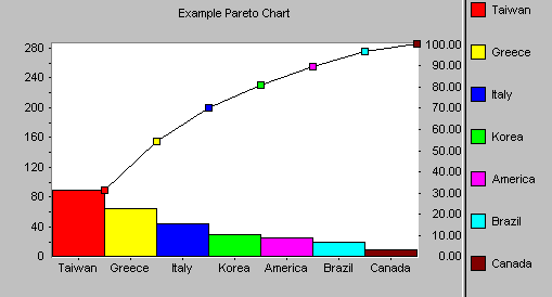
The Pareto effect even operates in quality improvement: 80% of problems usually stem from 20% of the causes. Pareto charts are used to display the Pareto principle in action, arranging data so that the few vital factors that are causing most of the problems reveal themselves. Concentrating improvement efforts on these few will have a greater impact and be more cost-effective than undirected efforts.
Things to look for:
In most cases, two or three categories will tower above the others. These few categories which account for the bulk of the problem will be the high-impact points on which to focus. If in doubt, follow these guidelines:
- Look for a break point in the cumulative percentage line. This point occurs where the slope of the line begins to flatten out. The factors under the steepest part of the curve are the most important.
- If there is not a fairly clear change in the slope of the line, look for the factors that make up at least 60% of the problem. You can always improve these few, redo the Pareto analysis, and discover the factors that have risen to the top now that the biggest ones have been improved.
- If the bars are all similar sizes or more than half of the categories are needed to make up the needed 60%, try a different breakdown of categories that might be more appropriate.
Often, one Pareto chart will lead to another:
- before and after charts
- charts that break down the most important factors discovered in an earlier chart
- charts that use different scales, such as number of complaints and the cost to respond, with the same categories.
Pareto chart statistics:
For the Pareto chart, the following overall statistics are calculated:
| Mean: | the average of all the values in the series, i.e. the average bar height. |
| Sum: | the sum of all the values in the series. |
If you are using the AutoPareto mode, the following statistics are also calculated for each class of data:
| Total: | The number of items in that class (bar). |
| Percentage: | The percentage of the whole data set which that bar accounts for. |

